
EXPLORING METAL SUBCULTURE IN A ZINE
A CASE STUDY
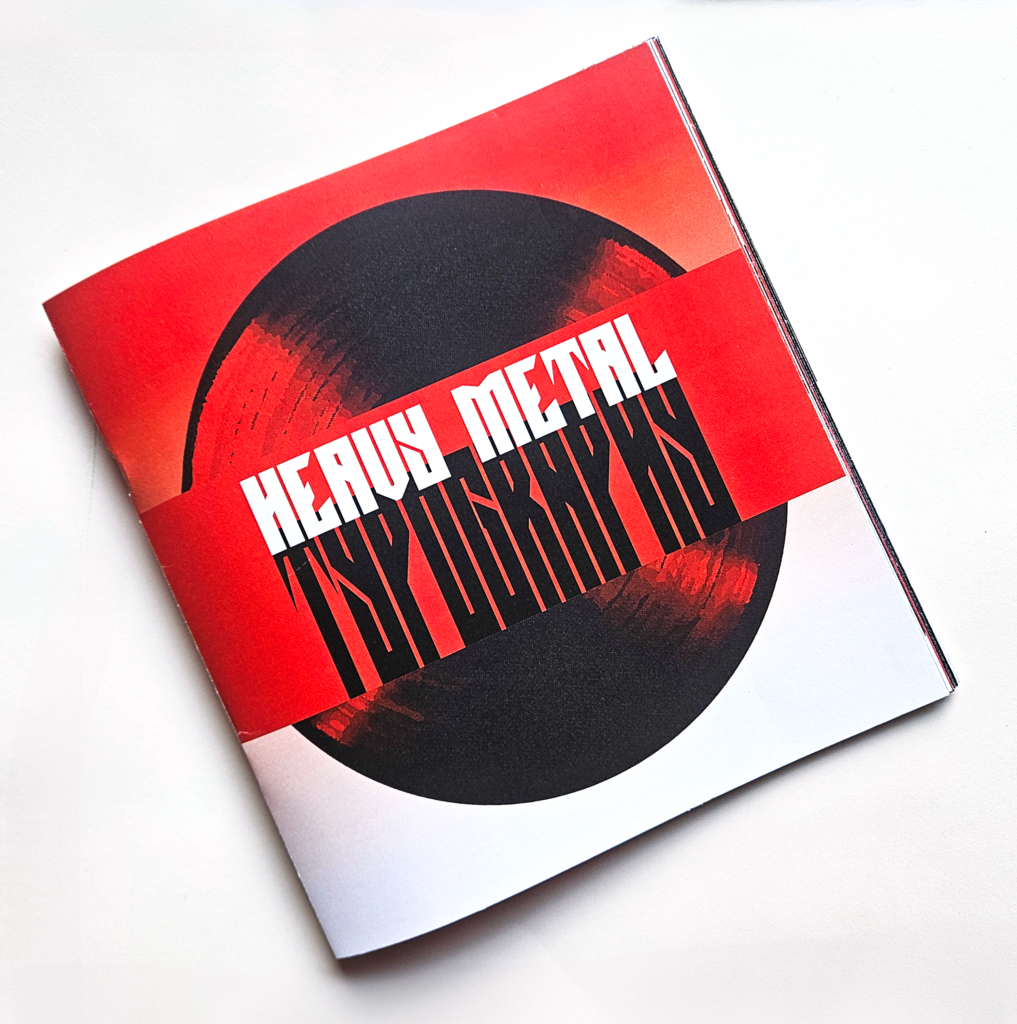
An application of typography and layout through a visual analysis of the metal subculture. I studied the intersection of typography in the heavy metal scene, then designed a zine which explored and applied the topic through the application of grid, layout, typesetting, and production skills. The project adapts the paper “The Logo in the Heavy Metal Culture – Understanding and Registration of Existing Codes and Visual Patterns” by Marco Alexandre and Rafael da Silva.
THE BRIEF:
APPLYING A TYPOGRAPHIC STUDY
As a synthesis of typographic skills learned over the course of a semester, this assignment asked us to research a topic related to the intersection of typography in a chosen field and communicate the topic through the creation of a zine.
As a lover of the music and aesthetics of the heavy metal subculture, I chose to focus my study on the intersection of typography and metal band logos.
THE DESIGN PROCESS
1 RESEARCH 2 PLANNING 3 PROTOTYPING 4 PRODUCTION
01. Research
To start my project, I first had to study my topic to get an idea of the content I would want to include in my zine. Through this process, I read through different papers examining the role of typography in heavy metal logos and made note of the key topics I might want to explore.
TOPICS
History and Ideology
Visual Characteristics
Genre Distinctions
Role of Illegibility
Use of Symbolism
Visual Classification
02. Planning
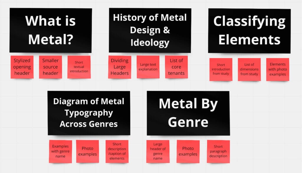
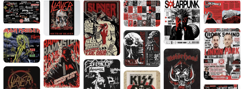
I organized these topics into sections of the zine, considering pacing and logical sequencing. I began to brainstorm visual and textual elements, and found text from the source to fit into each section. Next, I started to gather visual inspiration and make note of elements I would like to include in my design.
ELEMENTS
Large, Bold Typography
Distorted Photographs
Dark/Violent Imagery
Red and Black Color Scheme
High Contrast
Intense Visual Tone
03. Prototyping
I first sketched out my layouts, then translated them into InDesign. I developed a consistent grid structure, adapted sections to improve pacing, and implemented a cohesive visual style.
Through receiving peer feedback, I was advised to improve consistency among the layouts and remove unnecessary elements.
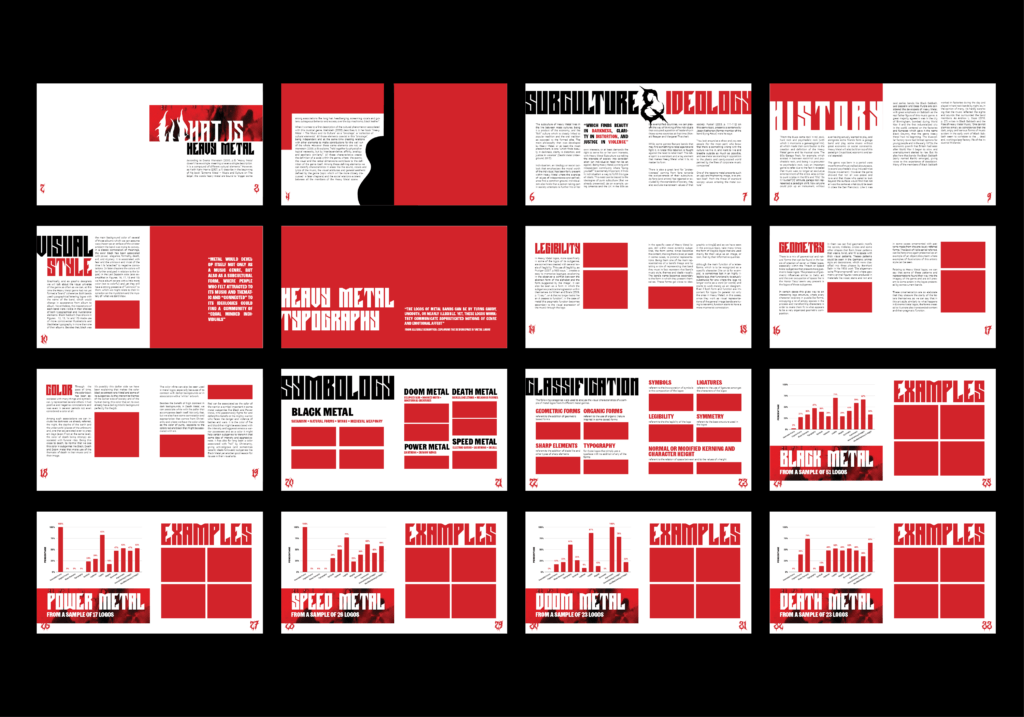
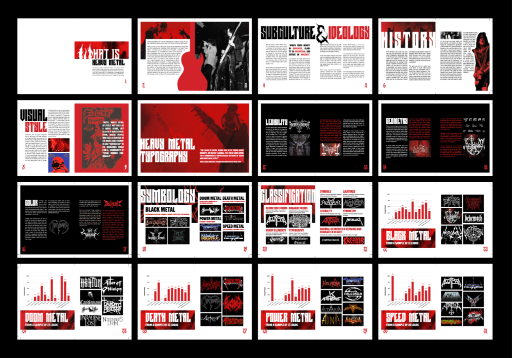
Once I was happy with the overall layout, I flowed images into my design. This required me to adjust for the darker visual weight of the logos. I responded by adding a section of black pages and adding backgrounds behind some of the headers.
04. Production
To prepare for production, I conducted a series of test prints. During this process, I made the decision to scale up my design by 145%. To adjust for the appearance of color on printed paper, I altered CMYK values to create a rich black tone, and removed sections of red text on black pages to improve legibility. Once I was ready for the final print, I moved on to trim my pages using the guillotine cutter.
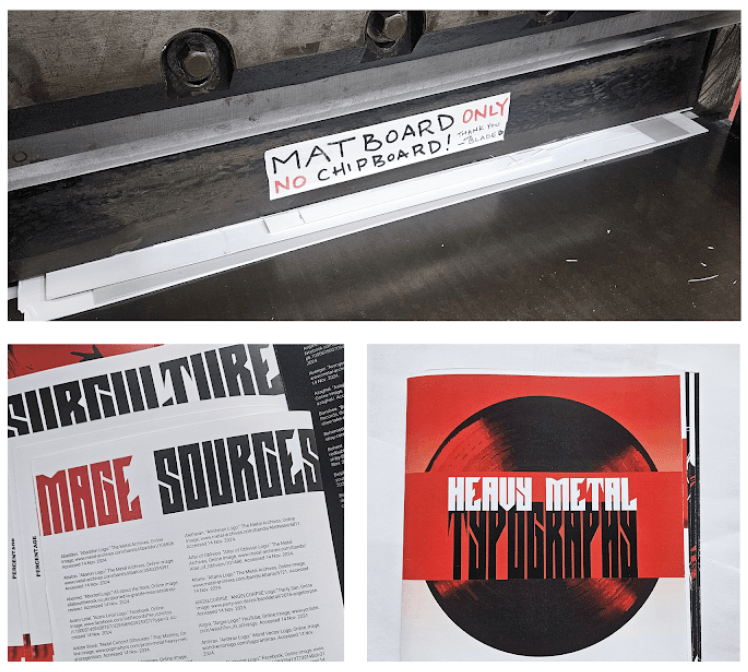
In this process, I encountered a series of errors.
First, I had attempted to trim off extra space next to a header. This resulted in the left and right pages being different widths. In an attempt to crop one side to even them out, I cropped content off of a header, forcing me to reprint.
I also experienced issues with folding, as the spread would not line up evenly on the scoring tool. I attempted to shift each page the same amount to the nearest ridge, but I was unable to do so consistently, resulting in a copy with excessive creep.
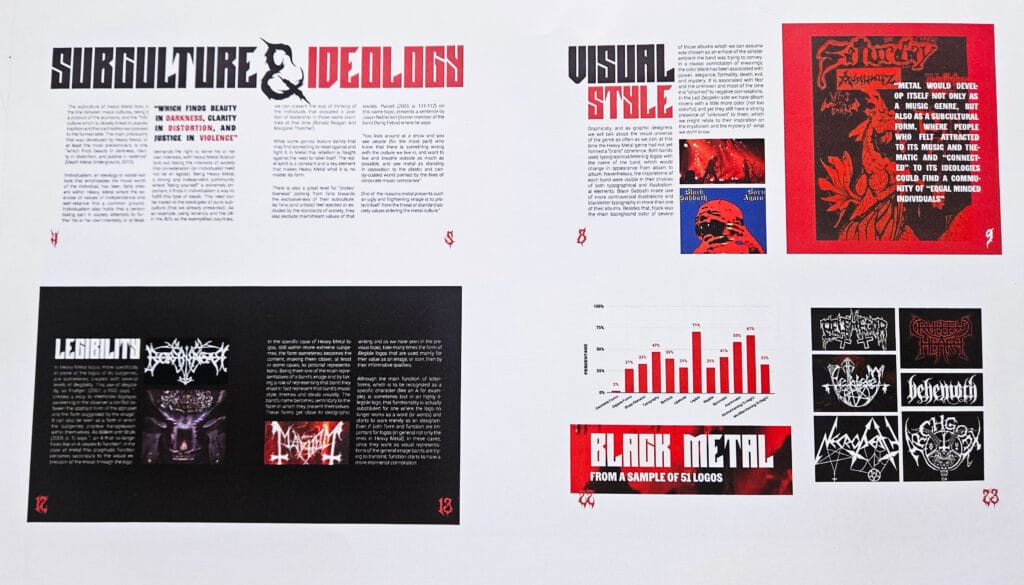
THE FINAL OUTCOME
FEEDBACK AND TAKEAWAYS
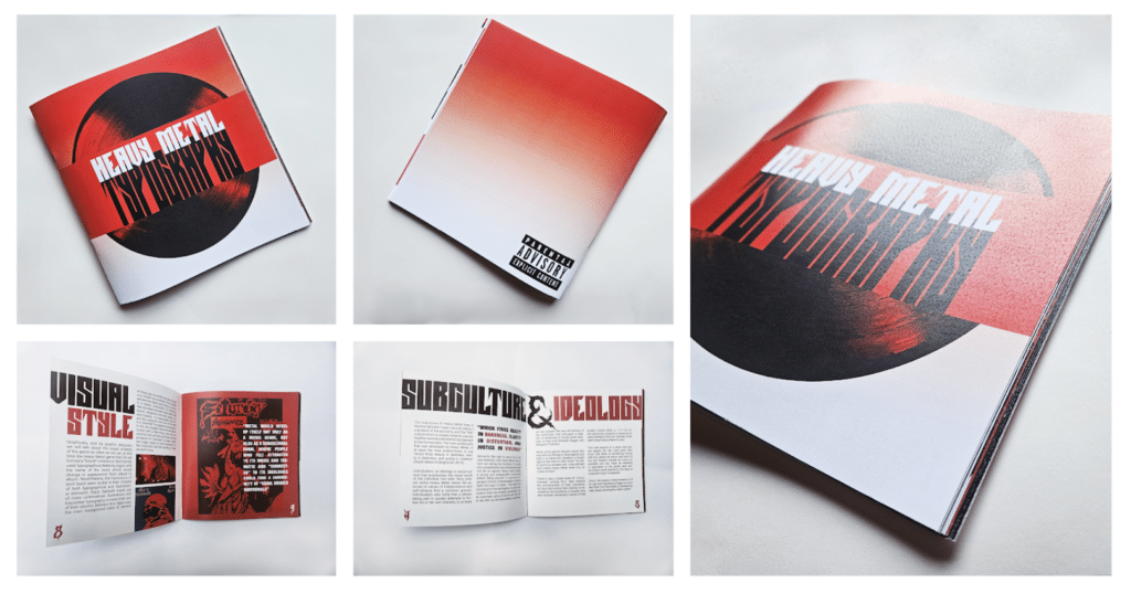
FEEDBACK
During our final critique, I received positive feedback on the engaging pacing, as well as the successful balance between bold headers and lighter body text. However, there were issued raised with the legibility of the black pages and a lack of variation in the final section of graphs.
REFLECTION
The project taught me how different typographic skills work together to create a unified work of editorial design. I developed the ability to design within a grid structure, and learned how the typographic choices I made would influence engagement with a text.

