
CAPTURING THE SELF THROUGH A LOGO
A CASE STUDY
An evaluation and visual exploration of my own self-identity through a logo design. I reflected on my own identity, performed visual research on topics and styles that represent myself, and encapsulated them in the form of three personal logos.
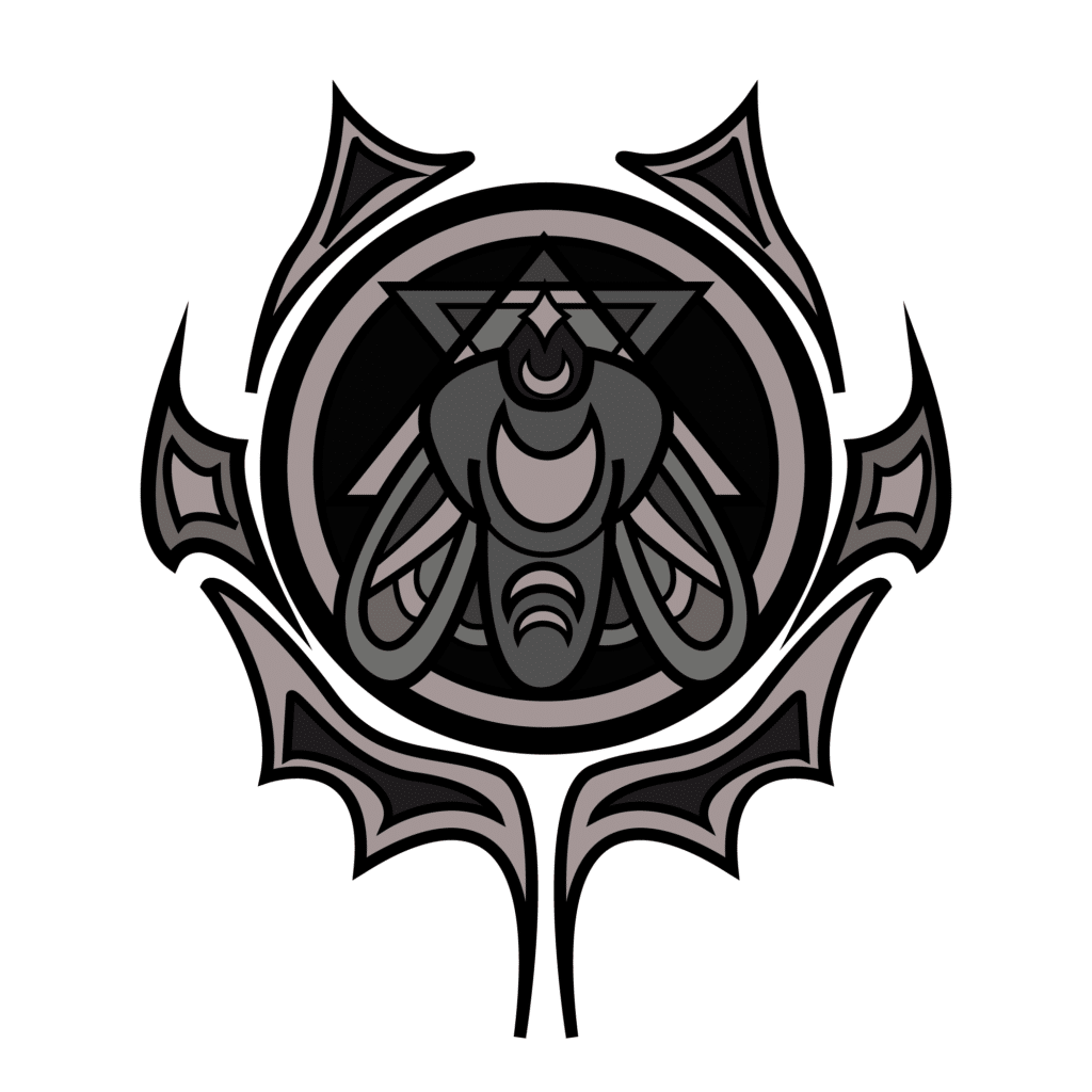
THE BRIEF:
CREATING A PERSONAL LOGO
The assignment asked us to design a personal graphic logo to represent ourselves and explain the symbolism of the various elements used in our logo. We were asked to select three of the seven logo types- lettermark, wordmark, pictorial, abstract, mascot, combination mark, and emblem.
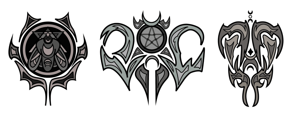
I decided to create a lettermark, emblem, and pictorial logo.
THE DESIGN PROCESS
1 DEFINING 2 SKETCHING 3 RESEARCH 4 DEVELOPMENT
01. Defining
In pursuit of self-understanding, I wrote a one page summary about myself. I explored my interests, heritage, how I label myself, and what beliefs are important to me. From the summary, I extracted topics and motifs to guide my design.
WORDS & MOTIFS
Moth
Distortion
Outsider
Pagan/Celtic Symbols
Fantasy Imagery
Semicolon/Infinity/Chaos
PERSONAL SUMMARY
I am Rogue Clawson. Rogue, a name taken from the X-Men. I am a lover of comics, a lover of science fiction, a lover of fantasy. Rogue, a name I share with my cat. I have always identified with cats. All Cats Have Autism, a formative book from my childhood. I am autistic, diagnosed at 6 years old and again last year. I have always felt like an outsider because of it, but I’ve learned to own it. I drift between subcultures, always drawn to the darker side of life. Goth, emo, metalhead, punk. I love music, love anything heavy, love lyrics that make me feel. In my free time, I am a poet. I’ve always had a drive to create. As a kid, I would look at the objects around me, and I dreamt of making my own. It seemed so magical at the time, creating something that becomes real, occupying space in the real world. I suppose it still is magical. I love horror, I love media that brings discomfort. We all get too comfortable sometimes. Part of being an outsider is finding beauty in the things on the outside. Recently I found a quote I identify with- “…which finds beauty in darkness, clarity in distortion, and justice in violence.” I identify with the moth, often compared to the butterfly, but beautiful in its own right. How do I define myself? Am I what I like, am I what I do? I am who I belong to? I could list labels- I am a nerd, a goth, a hippy, a punk. I am a writer, designer, dancer, gamer. I have Celtic heritage– a grandfather from Scotland and a grandfather from Ireland. My mother is pagan, worshiping the old celtic gods. I’ve always been fascinated by tales of gods and monsters. I’ve always wanted to believe there’s something more in this world. I don’t believe in magic, but I find magic in reality. I like to sit alone at night and marvel at how particles and energy can become such complex beings. How do I define myself, when everything I am is a complex pattern of reactions and chemicals and energy and so much more we can’t explain? I chase glimpses of understanding. I identify with the moth, chasing the light.
02. Sketching
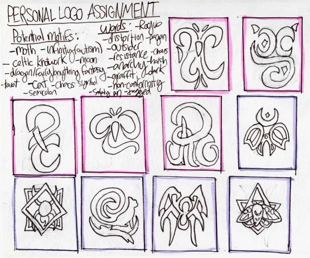
Using my topics, I developed an initial 10 thumbnail sketches to explore ideas. I drew inspiration from Celtic symbolism and explored different iterations of working my initials into imagery, experimenting with variations of the moth design.
While I was happy with the imagery I chose, I felt like these logos didn’t stylistically represent myself as well as they could have. Through receiving feedback, I was advised to revisit my personal summary for guidance.
03. Research
I listed out ideas and phrases from my summary that could guide my project’s stylistic direction.
In reflection, I was certain that I wanted to continue to use the moth motif in my designs, but now, I would take that image and transform it through styles that embodied elements of distortion, discomfort, and subcultures existing outside of popular culture.
- I have always felt like an outsider…but I’ve learned to own it
- Part of being an outsider is finding beauty in the things on the outside
- [I’m] always drawn to the darker side of life
- I love media that brings discomfort
- I found a quote I identify with- “…which finds beauty in darkness, clarity in distortion, and justice in violence.”
- I identify with the moth, often compared to the butterfly, but beautiful in its own right
- I identify with the moth, chasing the light
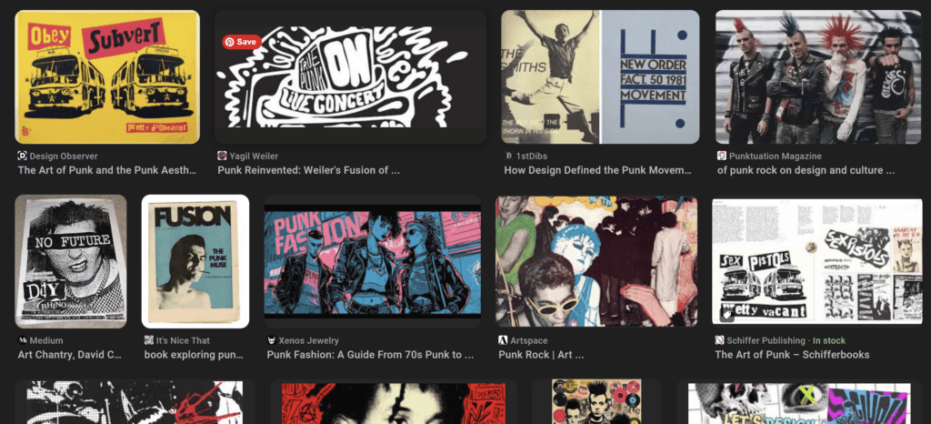
I decided to start by researching the styles of the punk movement. I made note of messy and jagged designs, themes of resistance, and the use of graffiti, collage, and other DIY styles.
While these elements were reflective of the motifs and themes I wanted to represent, I had to consider how to balance them with the gentler nature of the moth and integration of mystical imagery. This brought me to consider tattoo designs, which often incorporate gentle designs into a darker style.
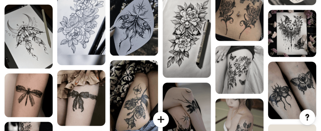
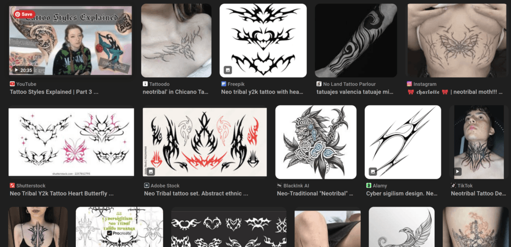
I found myself inspired by the neo-tribal tattoo style. With it’s thorny, bramble-like textures, it carried the elements of distortion I wanted to represent in my design while managing to balance it with more feminine imagery, such as butterflies, hearts, and of course, moths.
04. Development
Using the neo-tribal style to guide my design direction, I developed more focused thumbnail sketches, then selected my three favorite designs to refine and translate into Adobe Illustrator.
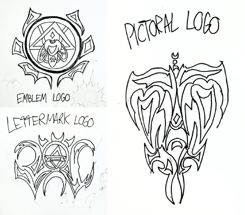
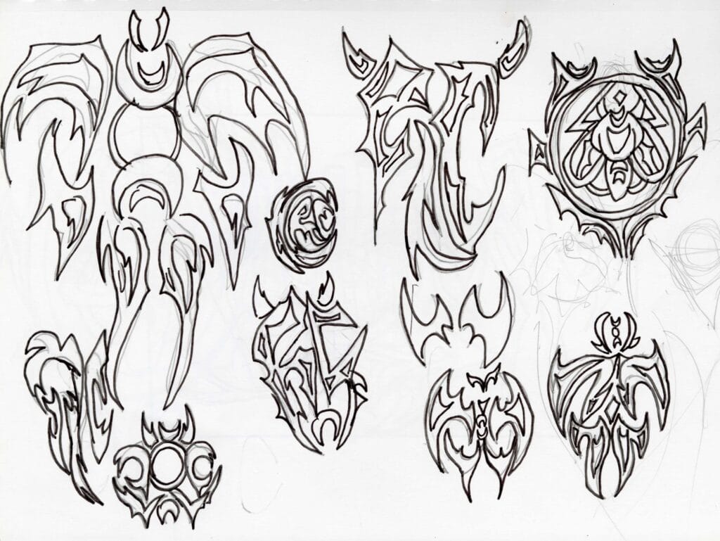
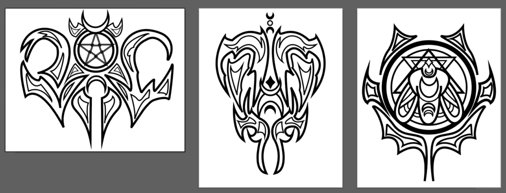
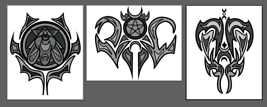
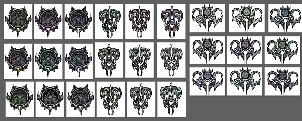
I created grayscale variants to explore the use of value in my designs, then created nine color variants for each of the three logos to experiment with color. I used jewel tones to convey mysticism, and muted colors to convey death and decay.
THE FINAL OUTCOME
FEEDBACK AND TAKEAWAYS
FEEDBACK
During our final critique, I displayed the color and outline variations side by side. My peers expressed a preference for the color versions of the designs, but identified issues with contrast and legibility. If I were to revisit the project, I would conduct test prints to examine how my logos would look at different scales and in different formats.
REFLECTION
The project taught me how to convey identity through the use of stylistic and symbolic design choices. It pushed me to consider the role of visual harmony in my design, and helped me develop the skills to develop an external identity through design choices, which could be useful for future logo and branding projects.

